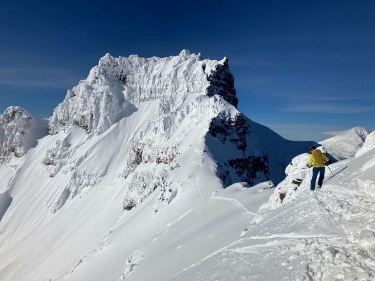
On this day, eyeing the snow canvas, the forecast aligned with real-time stability. On other day’s, avy forecasting and how to effectively communicate that info, can be challenging. Photo: Joe Madden.
Whether you are Mulan trying to use ancient pyrotechnics to set off an enemy-invader-burying-avalanche, or you have just taken your level-one and are heading out for a day of pow skiing, a myriad of users in the backcountry look for tools to empower informed decision making. If you are fortunate enough to recreate in an area hosting an avalanche center (as are most major zones in North America), avalanche bulletins are likely a mainstay in your decision-making process.
Avalanche bulletins trace their roots to post World-War I Europe. Military funding spurred research into formalizing avalanche forecasting on the heels of tragedy—During the war, as many as 8,000 troops are estimated to have died in avalanches in the Alps. Mountain troop divisions took on this role at first, and by the 1930s, public-facing avalanche information started to take shape (the earliest public ‘forecast’ I found a record of was from the Swiss Commission for Snow and Avalanche Research via radio in 1936). Forecasting in the U.S. started in the Northeast and spread west; the oldest avalanche center in the country is the Mount Washington Avalanche Center, one of 15 now run by the U.S. Forest Service. According to the American Avalanche Association, today, 23 avalanche centers across the U.S. issue avalanche bulletins.
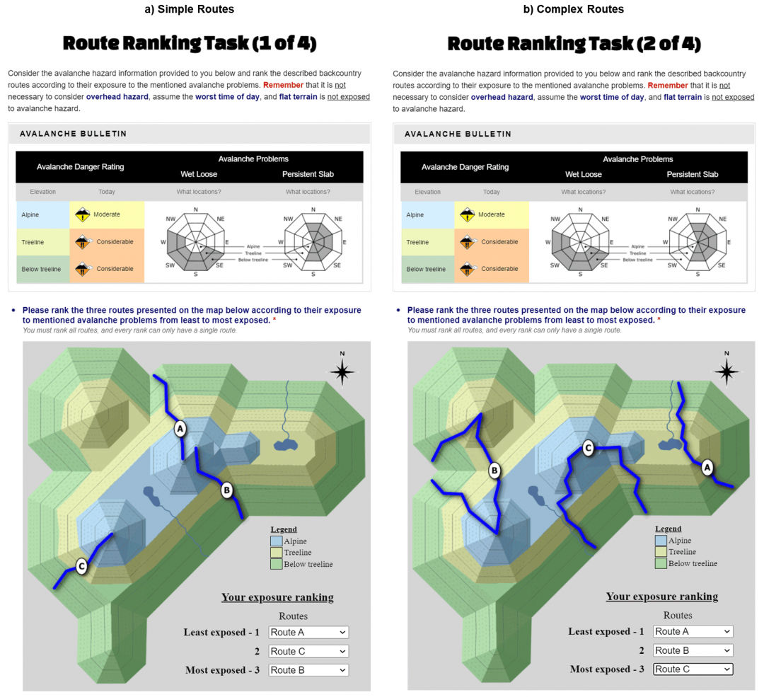
Terrain excercise from Katie Fisher.
(The full paper, from which this image was shared, can be found here.)
A regular part of decision making in the backcountry, avalanche bulletins across North America generally include three kinds of information: a rating on the danger scale, a rose and/or problem graphics, and a forecast discussion. The danger scale, used in both the U.S. and Canada since 1994 (and updated in 2005), ranks the avalanche risk and hazard in the familiar 5-levels from low to extreme (low, moderate, considerable, high, extreme), with corresponding travel advice for recreational users. A danger rose, or danger pyramid, maps the danger rating across aspect and elevation. More recent additions also include easy to digest problem summaries, for instance, a persistent slab graphic (or my favorite Alaskan springtime bear claw graphic when hibernation season comes to an end before ski season…it speaks for itself). The forecast discussion breaks down information behind the rating and primary problems.
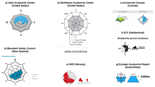
Screenshot examples of aspect and elevation representation of avalanche problems in public avalanche bulletins. From: “Impact of information presentation on interpretability of spatial hazard information: lessons from a study in avalanche safety”
(You can read the full paper, from which this image was shared here. The above symbols are screenshots from the following avalanche centers and were last accessed on April 1, 2021: (a) Utah Avalanche Center. (b) Northwest Avalanche Center. (c) Avalanche Canada. (d) New Zealand Mountain Safety Council. (e) Norwegian Avalanche Warning Service. (f) Swiss Avalanche Warning Service. (g) Euregio Avalanche Report.
Okay, let’s get down to business.
Many skiers religiously check the bulletin over morning coffee, others might get the danger rating on Instagram on the ride to the trailhead, and others just follow the skinner wherever it may lead. The manifold consumption of bulletins presents a challenge for both forecasters and users–information needs to be boiled down for some, more detailed for others, and will be used to shape decisions in, at times, inconsistent ways for different users: one product serves a community that spans activity, experience, interest, and risk tolerance.
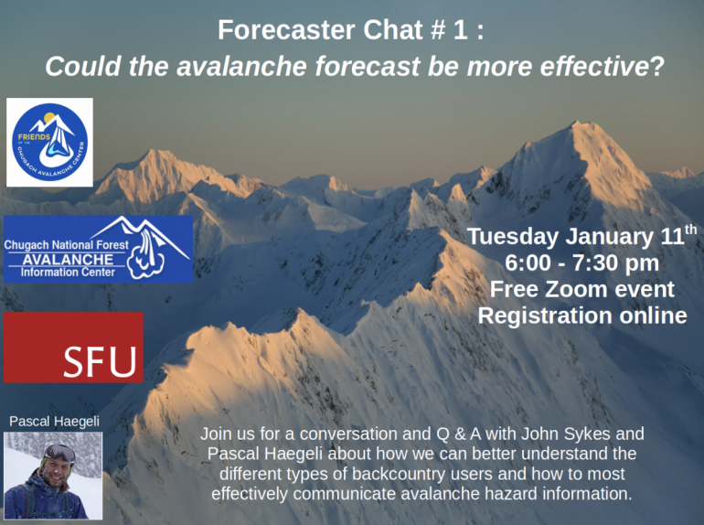
This challenge has spurred avalanche scientist Pascal Haegeli, Associate Professor of Resource and Environmental Management at Simon Fraser University, to research how the backcountry community uses avalanche bulletins to inform, more effective forecasting and information consumption. Dr. Haegeli was a recent guest with the Chugach National Forest Avalanche Center’s Forecaster Chats, speaking with forecaster John Sykes, also a Ph.D. student working with Dr. Haegeli.
Dr. Haegeli’s work emphasizes the value of understanding how different user types engage avalanche bulletins differently. Recent work led by graduate student Anne St. Clair delineates five typologies of user: those who don’t use the forecast, those who engage in rule-based decision making, those who determine risk exposure from a combination of the bulletin and terrain, those who incorporate specific avalanche problems into decision making, and those engaged in localized hazard assessment with the bulletin as a starting point. St. Clair and Dr. Haegeli’s results show that these typologies also tend to describe the structure of learning outcomes. For instance, those who use the forecasts for rule-based decision-making are likely only to identify a single relevant aspect of the bulletin – the danger rating.
While rule-based decision-making may offer an easy procedure for tour planning, users looking only at the danger scale may miss relevant information in the discussion (or even miss good data for tour planning beyond avalanche risk mitigation, like information pertaining to snow quality on different aspects). Part of this research asked backcountry users to apply a bulletin to a tour plan and found that many users who think they are applying basic concepts effectively often failed to consistently use bulletin information in a meaningful way. One example discussed was how users struggle to take known risks and convert them to a map when applying a bulletin’s avalanche problems list to terrain selection, often get caught up in “considerable” or “moderate” even when a discussion might point out that, say, no problems exist on westerly slopes above tree line.
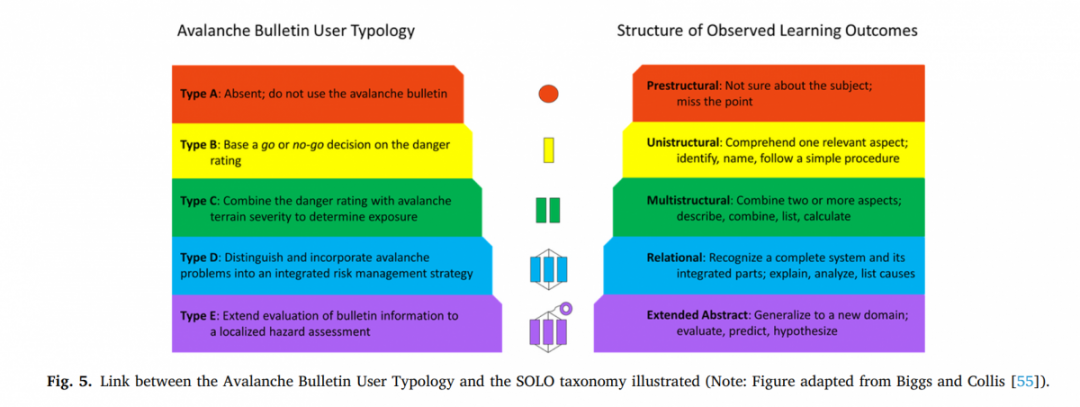
Link between the Avalanche Bulletin User Typology and the SOLO taxonomy illustrated. Figure adapted from Biggs and Collins. From: “Where the rubber of the RISP model meets the road: Contextualizing risk information seeking and processing with an avalanche bulletin user typology.
Other work from Dr. Haegeli shows that while most users view the avalanche danger scale as representing a linear increase in risk, in reality, the difference in the risk of triggering an avalanche between levels on the danger scale increases with the danger. So as the danger increases from low to moderate, there is less of an increase in avalanche risk than there is from moderate to considerable, or considerable to high. Dr. Haegeli explains that only 6% of users surveyed understood this nonlinear nature of the danger scale and that such knowledge does not depend on education or experience.
Sykes stresses the value to forecasters in better understanding perception like this and corresponding use patterns of bulletins. Sykes says, “If forecasters and the public don’t have the same interpretation of the danger rating, then it is starting on a rocky foundation…especially for users who use [the danger scale] as the deepest dive they are going into.”
A big takeaway, for me, from this kind of research is the irreplaceable value of reading forecast discussions – it’s the meat of the product. One example of this in Dr. Haegeli’s work is the finding that more novice users tend to think the information presented on an avalanche rose is more precise than it actually is. In essence, the challenge of boiling down avalanche danger to a simple-to-digest diagram can be misunderstood in a way that Dr. Haegeli thinks leads to “overinterpretation” of information. Dr. Haegeli also shows how decision-making can benefit from adapting to the tools available and getting a sense of how the sausage gets made. I know that if I ski at Turnagain Pass, for example, the forecasters out there like John get most information from the central part of the Pass and the Girdwood Valley. The forecast is a great start, but I really need to put the thinking cap on if I plan to venture a few valleys over from Tincan.
I caught up with Sykes after the chat, and he emphasized the value of using research to inform decision-making products. For example, his Ph.D. work is researching terrain maps that might offer an additional tool to converting forecasts into practice. Dropdown avalanche problem features, terrain rating (like the Avalanche Canada, Avalanche Terrain Exposure Scale terrain rating), avalanche run-out modeling, and observation pages may also increasingly become as central to the morning decision point as the bulletin itself. Observations already offer an avenue for more information, and any user can offer valuable insight into conditions by reporting woomphs, slabs, avalanches, or changes in conditions.
Haegeli says that while risk tolerance is on us as users of an avalanche forecast, he wants forecasting products to, “help different kinds of users know what they are getting into.”
This work gives a user-driven quantification to understand how we put bulletins into practice and has the power to make us think about how we make decisions more broadly, even beyond avalanche bulletins. The same dynamic seems, to me, to be at play if you’ve ever lamented a skin track in avalanche terrain, people following you to some distant slope, or the challenge of deciphering ‘yellow-flags’: we often use the same inputs to derive very different conclusions.

Example of Avalanche Canada’s tiered bulletin information format. Source: Image courtesy of Avalanche Canada & “Where the rubber of the RISP model meets the road: Contextualizing risk information seeking and processing with an avalanche bulletin user typology.”
The trend I see in the backcountry often boils down bulletins to a go or no-go, and increasingly sees ‘moderate’ danger as greenlight. Hopefully, as backcountry use continues to increase, so will data-driven communication, safety practices, and avalanche assessment. After hearing the forecaster chat with Dr. Haegeli and catching up with Sykes, it struck me as refreshing to simply engage in an explicit discussion of how we all use different information in our decision-making. It’s easy to take for granted the personal heuristics we come to adopt in our own tour planning, but research and community conversation can help us unpack our assumptions, information gaps, and complacency, as well as offer new ideas to help guide better assessment. So, how do you use the avalanche forecast?
Dr. Alex Lee lives in Anchorage, Alaska. Alex is a professor at Alaska Pacific University, teaching philosophy and environmental studies. He also works as a sometimes guide, naturalist, writer, and photographer.
